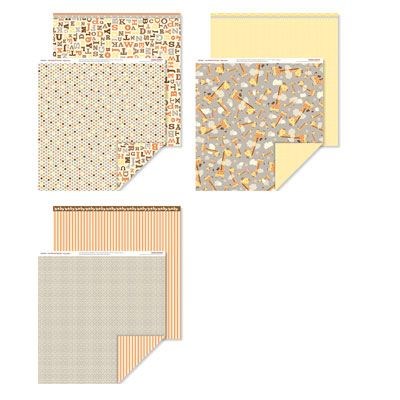
This layout was inspired by two totally different sources: the Babycakes paper packet I've been creating with for my layout club that met last night and a sketch at Simple Sketches.


I've missed the deadline to submit my layout for the challenge, true. But I'm still very excited about what I've created!
I love the look of these messy layers. They include lots of fun paper, but still let me get three large photos and a large journaling block on my page. This layout is heavy - with four layers of paper plus photos. If I had it to do over again, I would cut out the centers of the middle layers to conserve paper.
Because there were multiple patterns and colors, I kept the embellishments simple. Thickers, washi tape and a few Mocha Opaques.
I don't split my titles very often. This sketch called for a title and subtitle and I like the results.

Do you notice the date at the bottom of my journal block? It reads "photos winter '12; journal 1-14". When my journaling tells more about my feelings that the events of the photo, I often include the date of the story as well as the photos. Just as I want to record - and date - what we are doing using our photos, I want to record - and date - my feelings and stories. It is the stories, after all, that keep me scrapbooking.


No comments:
Post a Comment