Pages

Monday, June 10, 2013

Soak up the Sun - a musical challenge


I love music. I often listen - and sing along - while I create, so it seems only natural that sometimes I create layouts inspired by songs. This particular one was inspired by Sheryl Crow's "Soak Up The Sun".

left page
right page


The bright, sunny colors of the Dream Pop paper were the perfect with the photos and the title - Sheryl’s title - soak up the sun. 

I stamped the title using two different sizes of letters from the Trinity alphabet set. This is my current favorite alphabet because the three sizes make it so flexible. I don't usually use many themed embellishments, but the wooden sun burst was just the right touch. The round sun was also just the right balance to other very linear elements on the page. I decided to accent with buttons to add a few more round elements. 


This is the park nearest our house. We go there regularly. Every summer. I have already created other pages from this year (and other years) that told the story about going to the park. This time I decided to tell a slightly different story by listing the necessities of the trip. I borrowed (and modified) a line from the song- “we’ve got our 45 on” - to include it in my list-style journaling.

*Tip - If you have multiple sets of photos of very similar events, create a layout that tells a different part of the story.


*Tip - Create a visual triangle with similar embellishments. I used the washi tape and buttons in three different places.


What about the challenge, you ask? Create your own layout inspired by "Soak up the Sun"! You might choose to focus on the title, the lyrics, a memory of the song - whatever inspires you! Why not play along? Link to your layout in a comment on this post sometime this month. I'd love to see how this song inspires you. Also, this is the challenge I created for all of my friends who attend  Crop N Time events. If you're around here, why not join us on September 21?

Saturday, June 1, 2013

Sailing Away with Tommy on the Paper Trail

Welcome the the Paper Trail Blog Hop! This month we are sailing away with the Tommy paper packet. If you're coming aboard from Diane's blog, you are in the right spot. If this is your first stop, never fear, this hop is circular, so you can start your travels right here! These papers fit right in with the nautical trends in design and the colors - Cranberry, Honey and Outdoor Denim - are terrific!


We don't do much boating, but fortunately, I had some fishing photos which went well with the nautical theme. I created two coordinated one-page layouts that could easily sit side-by-side in my album.

Learning to Fish

I love nautical chart B&T paper! It made a perfect background for this layout.  Other bright colored B&T papers helped to lighten the layout as a whole.

The blocks of paper and the photos were very boxy so I chose to complement all of the boxy, cornered shapes with a half-circle for the title space. I used some old circular letter stickers from my stash along with the Cocktail Alphabet to create the title.
*Tip - Including one or two round elements can help to balance a layout that uses mostly straight lines and rectangles.


 I created this corner embellishment from strips of B&T paper, white baker's twine and Durables Round Studs. I folded the strips of paper over the twine and adhered them back to back. Then I trimmed the strips to the pennant shape and attached the Round Stud. I hung the pennant over the corner of my page and the rest is history!
*Tip - Use regular scotch tape to adhere the twine to the back of your layout. No one will see it and it is less expensive than scrapbook adhesive!


With Dad

This photo is from the same day as the two in the first page, but since I had already told the story of this fishing trip, I took the opportunity to write about fishing with my dad through the years. The text-print zip strip inspired a tribute to my dad. Since the journaling was a bit more personal, hid it between the mats (you can see the honey B&T peeking up).
*Tip - When you have "leftover" photos from an event, use them to tell a story about the person or the place instead!


Since my goal was coordinating single-page layouts, I used similar embellishments - Durables Round Studs and white baker's twine. For the title I dug out some other old letter stickers from my stash. I used creative capitalization because I didn't have any lower case "a's". It also helped to emphasize the word "dad" in my title.
*Tip - Use all caps - or all lowercase letters - for emphasis (as well as when you run out of the other!)


So glad you were able to sail this portion of the journey with me. I hope you'll stop back again soon. For now, bon voyage as you head off to Linda's blog where I'm sure you'll be inspired!


Wednesday, May 29, 2013

Dreaming of Dream Pop - Part 2

I'm continuing my attempts to share some of what I've created lately with a few more Dream Pop creations.

First Visit
The colors in this pack seemed perfect with a sunburst. They also looked nice with the colors of my daughter's shirt and the dentists' chair!


I added a few punched and cut out embellishments to this one. Additionally, I included baker's twine and Durables Round Studs.


The real story, however, happened after I took these photographs. My daughter say the layout displayed in our family room and told me she didn't want anyone to see it. I was surprised because I thought the photos were cute and my journaling told how well she had done on her first dentist visit. When I probed a bit more, she explained that she didn't want everyone to know what she was feeling at the time. It was too good to be true - a memory keepers' dream. After I explained that people couldn't tell what she was feeling from the photos, I encouraged her to write it out. She created a tag for her side of the story and we hid the journaling on the page.


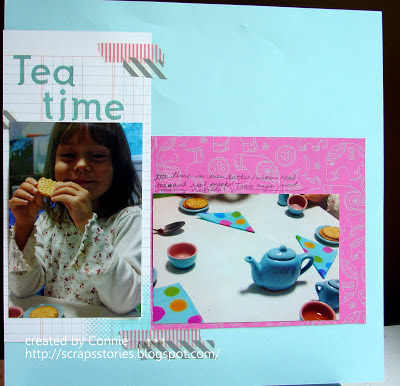
Tea Time
I pulled in some plain light blue cardstock to complement the colors in the kit this time. I couldn't believe how perfectly each color matched my daughter's tea set!


Two-page layouts are tricky to photograph, so here is a closer shot of each page:


Again on this layout I used washi tape to embellish. I think the designs with the printed "tape" make it the perfect choice for embellishment.


Pearls also seemed an appropriate choice for a layout about afternoon tea (as long as you don't look at the attire of the kids in the photos, that is.)


I am having a lot of fun playing with the papers in this pack. In case you haven't been counting, I've created 6 pages so far (and only added two sheets of cardstock.) I have created a few cards as well as two pages that are in progress on my desk right now - and there is still paper in the pack - full sheets of paper!

Remember, the Dream Pop special paper pack is only available through May (as supplies last). The pack which includes 12 cardstock sheets and 12 B&T duos can be yours for just $10 with a $35 order. Let me know if you want to get your hands on these fun colors!

Monday, May 27, 2013

Dreaming of Dream Pop - Part 1

I've been busy creating with CTMH's May special paper pack - Dream Pop. I love the bright colors, the fun patterns, the trendy banners and pennants. I've been creating much more than I've been blogging, so I plan to use this last week in May to catch up a bit by sharing many of my Dream Pop creations.

This first layout is simple and really focuses on the details of the paper.


In addition to my photos, I added a mat, a journaling spot, Slate polka dot washi tape and a few flowers.

The yellow "tape", the multicolored geometric pattern and the "Beautiful" pennant are all printed on the paper! The page came together quickly and the simple paper helped me to keep the attention where I wanted it - on my daughter's photo!


I used the details on the paper for my second layout as well.  This time I chose to accentuate two features - the left hand banner and the flower cluster in the bottom right corner.


Here are some details:


I fussy cut some of the flowers from the second sheet of the matching paper. I used foam adhesive to add some dimension and then accented them with Liquid Glass. I added a bit of washi tape to make the corner feel more finished.


I added more paper strips, some washi tape and a few fussy cut flowers to the left had banner. I also included my title and journaling directly on the paper.


The first colors I noticed in this pack were the Raspberry, Strawberry and Tangerine.  I liked those colors, but I wanted to stretch so that I could focus on Banana, Grey and Mint as well.


I loved the glossy resist pattern on the cardstock. I liked the tone on tone effect of the glossy for the background of my page. I decided to play with the glossy resist a bit around the edges. I used a sponge and applied the ink directly to the paper. When the whole border was inked, I used a tissue to wipe the excess ink off of the resist pattern.

I was inspired by the May Stamp of the Month to add a few pinwheels as accents. Rather than stamping them, I cut them out so that I could show off more of the patterns.

The title and journaling block is from another sheet in the pack.

Although I did use the Banana, Grey and Mint that I set out to use, I also used a quite bit of the other colors. They work well together, so I'll go with it!


Remember, the Dream Pop special paper pack is only available through May (as supplies last). The pack which includes 12 cardstock sheets and 12 B&T duos can be yours for just $10 with a $35 order. Let me know if you want to get your hands on these fun colors!

Sunday, May 12, 2013

A couple of cards to say...

Happy Mother's Day!


Both cards were made using CTMH paper from one of my many scrap bags and retired stamps. Can you name any of the paper packets featured here? I'll give you a hint, the green pattern on the second card is from a current pack, that is the only one!

Hope your day was great!

Friday, May 3, 2013

A humble scrapper in the news

What happens when your day job and your creative outlet mingle? Sometimes co-workers get creative cards or gifts. Sometimes a work friend gets bitten by the creativity bug. Sometimes you end up in the school paper!

One of my students recently completed a feature article about my scrapbooking for the online school paper. He was very diligent with his interviews returning with follow up questions on more than one occasion. It is always interesting to read another's interpretation of your words, but I think he did a good job. The experience was enlightening for me as the subject. I thought about my craft in a new way as he doggedly asked questions, and I was able to share my hobby with a new set of people.

A scrapper at heart, I think it is only a matter of time until the story becomes a layout!


Wednesday, May 1, 2013

Skating Along the Paper Trail

Welcome to the Paper Trail blog hop! This month we're sliding into May with the Later Sk8r paper packet. You may be skating on in from Betsy's blog or this may be your first stop. Either way I'm sure you'll find some inspiration!

I love the colors and patterns in this paper (even if the English teacher in me cringes each time I type the name). The cool blues and greens are right up my alley, and since I have a little guy who has a birthday this month, I am especially enjoying this pack right now.

This month I created a few simple all occasion cards. I was surprised at the versatility of this paper. I would gladly give these cards to any friends - male or female!


I liked the distressed look of the papers. They seemed to fit well with the Slate Washi Tape. This tape is quickly becoming a go-to embellishment for me.

It is very easy to use and you can add it to projects in so many different ways. It comes on a roll and you can cut it with scissors or tear it just like masking tape or painters tape. It is sticky so adhering it is super simple!

Sometimes I use washi tape as an additional adhesive, or to accentuate the way individual pieces are joined together. It can serve as an embellishment and can even be a substitute for ribbon or strips of paper.

Thanks, again, for stopping in. Check back later in the week for more updates on my latest crafting endeavors including the invitations to my little guy's party using the Later Sk8r paper and a fun new stamp! Until then, I skate on over to Vicki's blog to see what she has created. I'm sure you'll find something inspirational!