The first sketch I used was from Stuck?! Sketches. Isn't it fun?
I usually scrap 12X12, so I modified the sketch a bit. Here is my take:
I used some very old paper from CTMH (Precious Paisley). I thought it was perfect for a baby shower! I liked the circle included in the sketch behind the photos, but it didn't work with my photos. Instead I used three small circle stickers and some sparkles to add interest to the linear design of the layout.
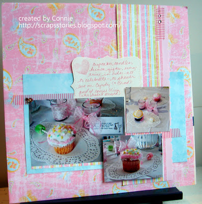
The second page I created based on a sketch at Sketches in Thyme:
 I didn't feel the need to include a title on this page since the journaling, photos and products link it closely to the page above. The photos I used were too large to be lined up across the layout. I am pleased with the way this cluster of photos contrasts with the more linear page above.
I'm finding this idea of creating companion one-page layouts is really working for me. I get the benefits of both types of designing - the smaller canvas of the 12X12 but the simplified product choice of the 12X24. The variety of sketches available in 12X12 but the ability to tell a story of 12X24.
What about you? Do you know any good challenge blogs? Have you discovered any tricks that are really working for you right now? I would love to hear from you!


Love both of them!
ReplyDeleteThank you!
DeleteI love how the second page you clustered the photos and didn't make them linear. I think it really gives the page great feel. Love them both ♥
ReplyDeleteThank you!
DeleteThank you for your participation in our sketch!
ReplyDeleteBeautiful page and photo !!!!!!
kisses!
Thanks for the fun sketch and the comment!
DeleteGreat take on the sketch. Thank you for joining us at Sketches in Thyme!
ReplyDeleteSurama
Thanks for the great sketch and the comment!
DeleteDelicious!
ReplyDeletetks for playing with us at SIT
xx
Leila
:)
It was a fun sketch. Thanks for the inspiration!
Deletegreat layouts, the sketches work well together as companions! Thanks for joining us at Sketches In Thyme! =) Tiffany
ReplyDelete